(editor note: I'm putting all of the artist statements here because I'm having a lot of trouble with formatting further down the page- also weebly made some of the photos crunchy which I don't know how to fix as they were fine when I exported them from photoshop and I did check that the sizing was not too large or small.)
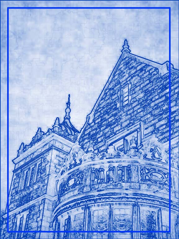
LAW QUAD :
I believe this is one of the buildings on the U of M law quad, although I don't know exactly what its called. I love the architecture of these buildings, especially the cement molding and turrets. I am glad that the buildings seem to have stayed in good condition. They also bring back nice memories of walking around downtown and on campus with my friends. We would never sneak into the buildings to see the library.
CLOCK TOWER:
I like this building due to the fact that its very tall, which reminds me of my brother. some errors I with my photos is that, due to the height, I had a very hard time getting photos that had the whole building in them without a very wacky angle. Sometimes its good to have fun angles, don't get me wrong but I was struggling with this one. Anyways, I really like the photo in which the corners of 2 other buildings are blocking out space next to the tower. I think it adds a interesting element to the photo and situates the building more.
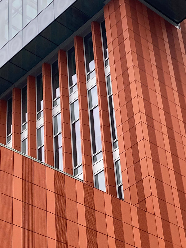
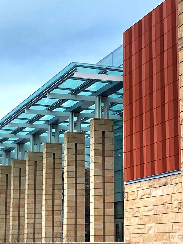
ORANGE :
I actually don't know what this building is- I think it may be some kind of arts center? It is located next to campus. for this one I chose to take mostly photos of specific design elements I liked on the building. I'm really pleased with the orange corner one, and I think the bright color brings a good element of variety to my photos as a whole. Most of the other buildings lack brighter colors as they are brown or grey. This was my favorite building to take pictures of, and I can't think of any issues I had with it.
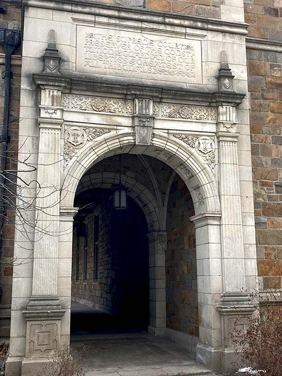
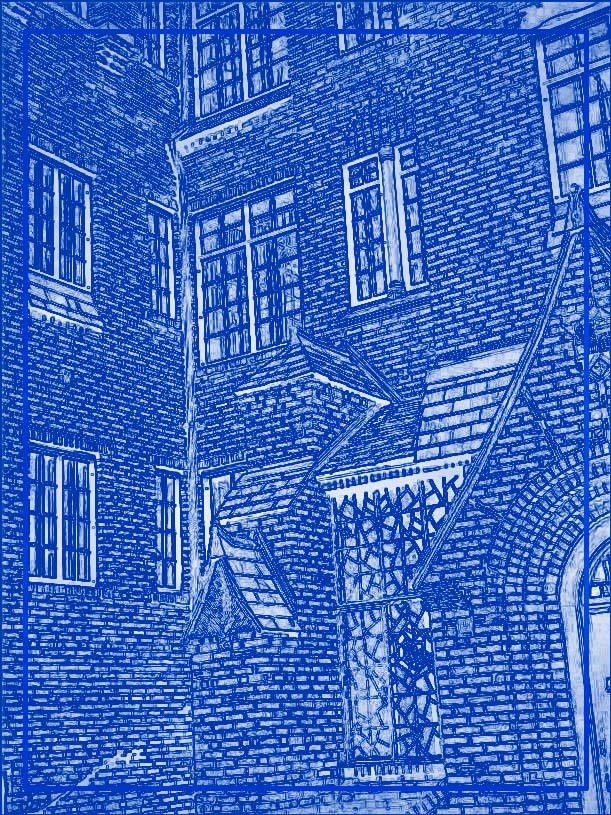
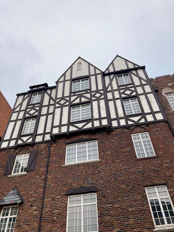
THE ONES THAT LOOK LIKE OLD GERMAN ARCHITECTURE :
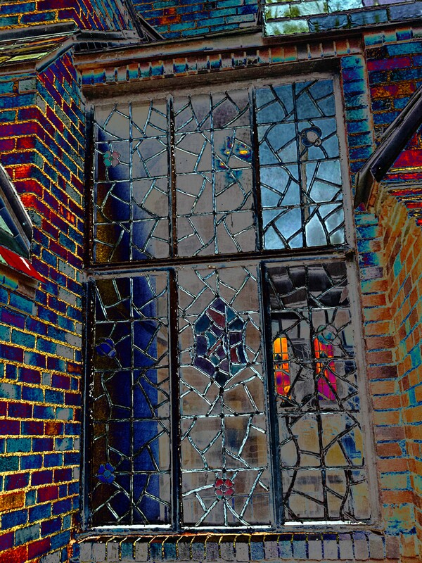
These buildings please me because I imagine I'm in a quaint little village. I don't know what the buildings are used for, except that they are currently owned by UofM. There is a little sign outside that says tavern, but using context I don't think that's accurate to its current inhabitants. A triumph I had with this building was not the photos but the editing. When taking a picture of the stained glass window I had hoped it would be very nice and colorful, but my photo did not turn out. So I used photoshop to make the whole thing nice and funky, (without a filter of course) and I really like the way it turned out. Now it appears as if the whole picture is stained glass, not just the window.
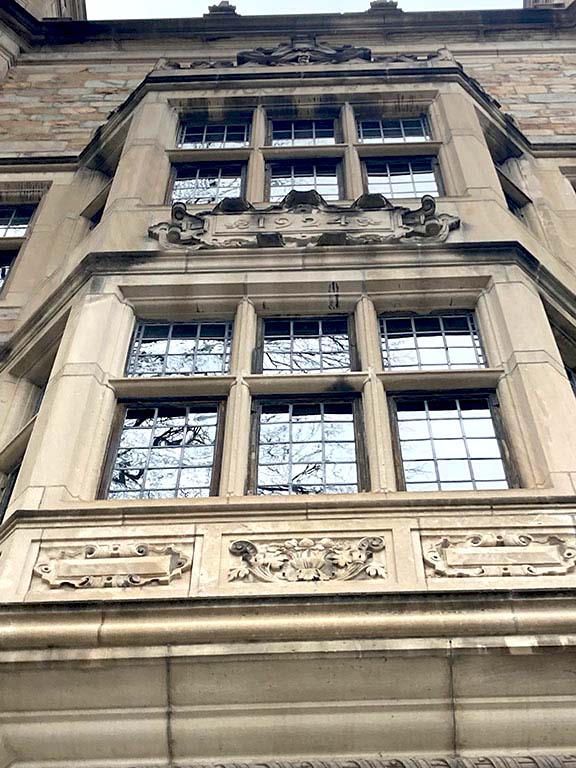
RACKHAM AUDITORIUM:
This was overall my least favorite building to take photos of. Although the blueprint turned out nice, I just dont think the building as a whole is very interesting. It has some lovely smaller details (which is what I tried to focus on in my photos) but the rest Is just big slabs of stone. It does garner bonus points from me for being the location of Top of the Park, which brings back nice memories.
LAW QUAD :
I believe this is one of the buildings on the U of M law quad, although I don't know exactly what its called. I love the architecture of these buildings, especially the cement molding and turrets. I am glad that the buildings seem to have stayed in good condition. They also bring back nice memories of walking around downtown and on campus with my friends. We would never sneak into the buildings to see the library.
CLOCK TOWER:
I like this building due to the fact that its very tall, which reminds me of my brother. some errors I with my photos is that, due to the height, I had a very hard time getting photos that had the whole building in them without a very wacky angle. Sometimes its good to have fun angles, don't get me wrong but I was struggling with this one. Anyways, I really like the photo in which the corners of 2 other buildings are blocking out space next to the tower. I think it adds a interesting element to the photo and situates the building more.
ORANGE :
I actually don't know what this building is- I think it may be some kind of arts center? It is located next to campus. for this one I chose to take mostly photos of specific design elements I liked on the building. I'm really pleased with the orange corner one, and I think the bright color brings a good element of variety to my photos as a whole. Most of the other buildings lack brighter colors as they are brown or grey. This was my favorite building to take pictures of, and I can't think of any issues I had with it.
THE ONES THAT LOOK LIKE OLD GERMAN ARCHITECTURE :
These buildings please me because I imagine I'm in a quaint little village. I don't know what the buildings are used for, except that they are currently owned by UofM. There is a little sign outside that says tavern, but using context I don't think that's accurate to its current inhabitants. A triumph I had with this building was not the photos but the editing. When taking a picture of the stained glass window I had hoped it would be very nice and colorful, but my photo did not turn out. So I used photoshop to make the whole thing nice and funky, (without a filter of course) and I really like the way it turned out. Now it appears as if the whole picture is stained glass, not just the window.
RACKHAM AUDITORIUM:
This was overall my least favorite building to take photos of. Although the blueprint turned out nice, I just dont think the building as a whole is very interesting. It has some lovely smaller details (which is what I tried to focus on in my photos) but the rest Is just big slabs of stone. It does garner bonus points from me for being the location of Top of the Park, which brings back nice memories.
the Castles' Edge |
Into the Dark |
Sky Glass |
Modern Blue |
Orange Triangle |
Pillars |
Many Bricks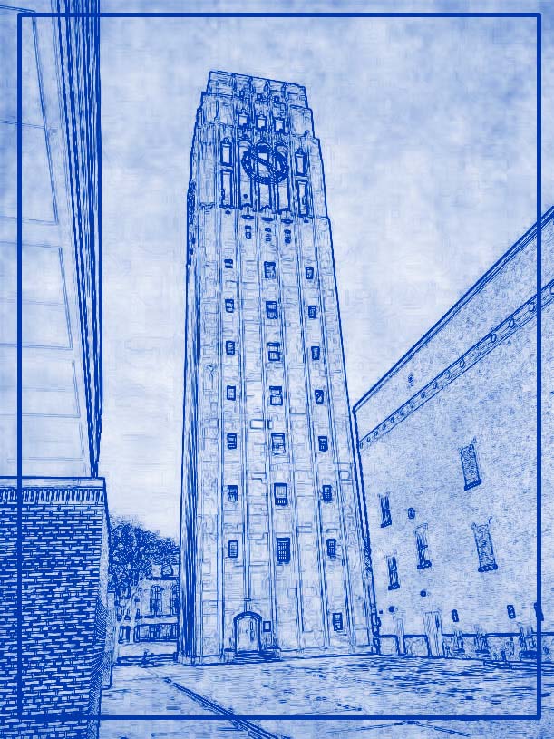
Clocktower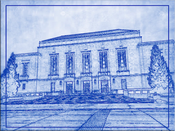
The Only Landscape |
Germany (for sure)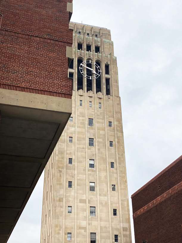
shorter
Quaint Lighting |
Stained Glass Surroundings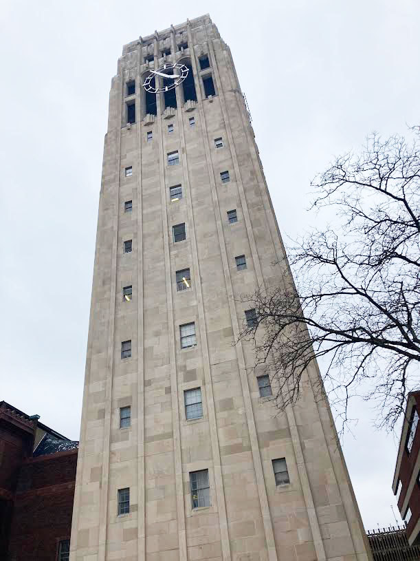
taller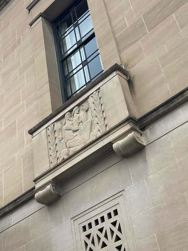
a Maiden's Gaze |
